Five things we learned from the English Housing Survey
Posted: March 2, 2017 Filed under: Home ownership, Private renting, Social housing | Tags: English Housing Survey Leave a commentOriginally published on March 2 on my blog for Inside Housing.
So what have we learned from the new English Housing Survey? The largest annual survey of households and housing conditions is just out for 2015/16 and here’s what caught my eye.
1) ‘The fall in owner-occupation has abated’
The official story is one of relatively little change this year: the number of owner-occupiers seems to have stabilised at 14.3m and there were still 3.9m social renters. The survey says that ‘the rate of owner occupation has not changed since 2013-14, indicating that the fall in owner occupation has abated’. Here’s the graph summing up the trend:

However, that’s not the full story. First, a note of caution: the 2013/14 survey had sampling issues that probably exaggerated the fall in home ownership and rise in private renting in that year. As a result last year’s survey showed a surprise fall in private renting and slight rise in owner-occupation that was hailed as a turning point by the government. Private renting resumed its rise in 2015/16, with the number of private renters up 250,000 at 4.5m.
2) But mortgaged ownership falls below 30%
The picture changes again if you look at the proportion of households in each tenure rather than the number. The survey shows that the owner-occupation rate fell to 62.9%, the lowest it’s been since 1985, while private renting rose from 19.0% to 19.9% and social renting fell slightly to 17.2%. Decline abated? Not so much.
And if you break owner-occupation down further you can see what’s happening. The proportion of outright owners is still rising (to 33.9% in 2015/16) as older owners pay off their mortgages. However, the proportion of households buying with a mortgage fell to just 29%. That’s probably the lowest it’s been since the 1970s. The mortgaged ownership rate peaked at 43% in the early 1990s but anyone who took out a loan then is just about paying it off now.
These two graphs for London and outside London show the more detailed pattern:

Note that if you break housing down into four tenures, private renting overtook buying with a mortgage to become the biggest tenure in London in 2013/14. However, note too that the decline in buying with a mortgage has been even steeper outside the capital: from 43.4% as recently as 2003 to just 29.5% in 2015/16. Outright ownership became the biggest tenure outside London in 2012/13.
3) Some hope for Generation Rent?
It’s not all bad news for young people who feel priced out of buying. The English Housing Survey also shows that the number of first-time buyers rose 16% to 654,000 in 2015/16. Overall that’s the highest it’s been since the financial crisis but the good news only applies outside London: the number of successful first-time buyers in the capital fell again to just 114,000.
This could show that all the loans and guarantees ploughed into Help to Buy are having some impact. The owner-occupation rate for households aged 25-34 rose again for the second year in succession:

And this was also reflected in an increase in the proportion of 25-34s who are buying with a mortgage to 34.7%. The celebrations may be muted though: as recently as 2007/08 more than half of this key age group had a mortgage and in 2015/16 46% of them were private renters.
The mortgage ownership rate fell again in 2015/16 for every other age group and the private renting rate rose. Was Help to Buy filling a leaking bucket?
4) Earn more, pay less. Earn less, pay more
In a housing market characterised by high house prices, it’s not surprising that it’s the highest earners who are able to buy. The next graph shows weekly household income by quintiles in each tenure going from the fifth of households with the lowest incomes on the left to the fifth with the highest incomes on the right:

The pattern is the opposite for buying with a mortgaged and social renters but much more even for outright owners (who are mostly retired) and private renters.
But look what happens when you look at housing costs as a percentage of that income:

Relatively higher earning people with mortgages also benefit from record low mortgage rates despite high house prices. Thanks to high rents, private renters are spending twice as much of their income in housing costs. And despite lower rents social renters are paying almost as much out of their lower incomes.
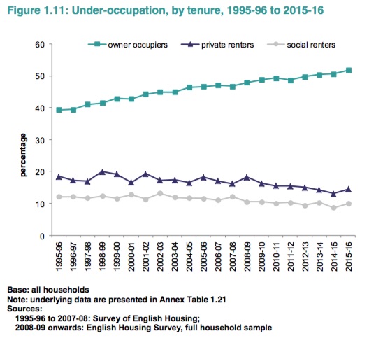
5) Whose rooms are really spare?
Remember how the bedroom tax was meant to release larger social rented homes for families who are desperately overcrowded? It doesn’t seem to be working out that way so far.
First, for all that talk about a ‘spare room subsidy’, as everyone knows social tenants are actually the least likely to under-occupy their homes. Here’s the graph based on the more generous bedroom standard used in the English Housing Survey (under-occupying means having more than one spare room):
More than half of owner-occupiers under-occupy on this measure compared to just 10% of social renters, a proportion that actually rose slightly last year.
Now look what’s happened to overcrowding. The tenures are in the opposite order:
But note that the overcrowding rate in the social rented sector peaked at 7.3% in 2010/11 before falling for the next three years. The bedroom tax was introduced in 2013/14 but after two years of increases overcrowding is now higher than it was then. Outside of causing misery and hardship to the families affected, how much impact has the pernicious measure really had?
